
Introduction
The other day I wrote a quick post about a few tricks for speeding up plots in R, and specifically in “base” R (i.e. not ggplot). However after writing that post my brain didn’t stop thinking about it, particularly since the third solution I provided there (to just subsample the data before plotting) didn’t really sit well with me, since there’s a good chance that it could produce a plot that looks different from one made with the entire dataset, due to subsampling away the variability that gives a plot it’s “character”.
I thought a bit about why R is so slow at plotting, and after some reading/googling/chats with colleagues it seems that it is likely because the plot engine in R is very old (the first release was in 1995!!!) and likely hasn’t been touched/updated much to account for changes in data size over the years. The basic problem (as I understand) is that R just tries to draw everything you tell it to draw – there isn’t much too smart about, say, not drawing things that you would never be able to see. Further, because it has some nice vector drawing capabilities (mitred lines, etc) plotting a large dataset involves a lot of calculations about how to do corners, shapes, etc etc. Which makes it SLOW when plotting millions of data points. The speed can also depend on the operating system, or more specifically on the “graphics device” that is used, which is why in my last post I pointed out about using the x11(type="Xlib") device when working on linux and OSX (sadly not available in Windows).
So what felt like it was missing after my other post was that my “solutions” were:
- not cross platform,
- involved other languages (e.g. python), and
- would very likely change the visual character of the plot, which completely negates even bothering to plot it!
So after a bit of thinking, I decided to explore this further – to see if I could come up with a scheme/function that could be used to make nice time series plots of large data without having to wait for 10 minutes.
A faster plot
Because I don’t want to have to recode the graphics engine that R uses (in other words, I’m stuck with the fact that R will draw each and every point that is passed to it regardless of whether you’d be able to see or even differentiate it on the screen), the trick is to decimate (reduce) the number of points but retain the basic properties that give the plot its “look”.
First, because this approach is based on decimation, it is bound to fail when doing a scatter plot. In such cases, the most reasonable solution is to use a quick plotting character (like pch=".").
However, for making line plots (such as the default for oce.plot.ts()) the problem is a bit easier, since the line connecting the points will naturally obscure the lack of points when there are many of them being rendered into a single screen/image pixel. It turns out that drawing lines in R is also slower than drawing points, so this is a good case to work on speeding up through decimation.
When looking at a line plot with lots of points, the basic shape of the plot is largely defined by the maxima and minima. Think of those little “blobby” waveforms that show up when you record a voice memo on your phone – there is too much data compressed into a small area to be able to see the waves that make up the audio signal (e.g. with frequencies of hundreds to thousands of hertz). So what you end up seeing is the changing amplitude (or volume) of the recorded waveform. This suggests that the important features to retain for decimation are the maxima and minima of the decimated series.
Inspired partly by this Stackexchange answer (not actually the one that was chosen for the question), I set out to build a simple function that would decimate a long time series into a new (shorter) time series that retained only the min/max of the decimated chunks. Let’s go through the steps.
Building the function
First, we fire up R and create a “big” time series (e.g. one “million”1 data points):
set.seed(123)
library(oce)
## Loading required package: gsw## Loading required package: testthat## Loading required package: sf## Linking to GEOS 3.8.0, GDAL 3.0.4, PROJ 7.0.0N <- 1e6
t <- as.POSIXct("2021-01-01", tz="UTC") + seq(0, 86400, length.out=N)
x <- rnorm(t) + sin(2*pi*seq(0, 86400, length.out=N)/(12.4*3600))On my (somewhat crappy Windows subsystem for Linux) machine, making a line plot (to a basic cairo device) takes about this long:
st <- system.time(oce.plot.ts(t, x))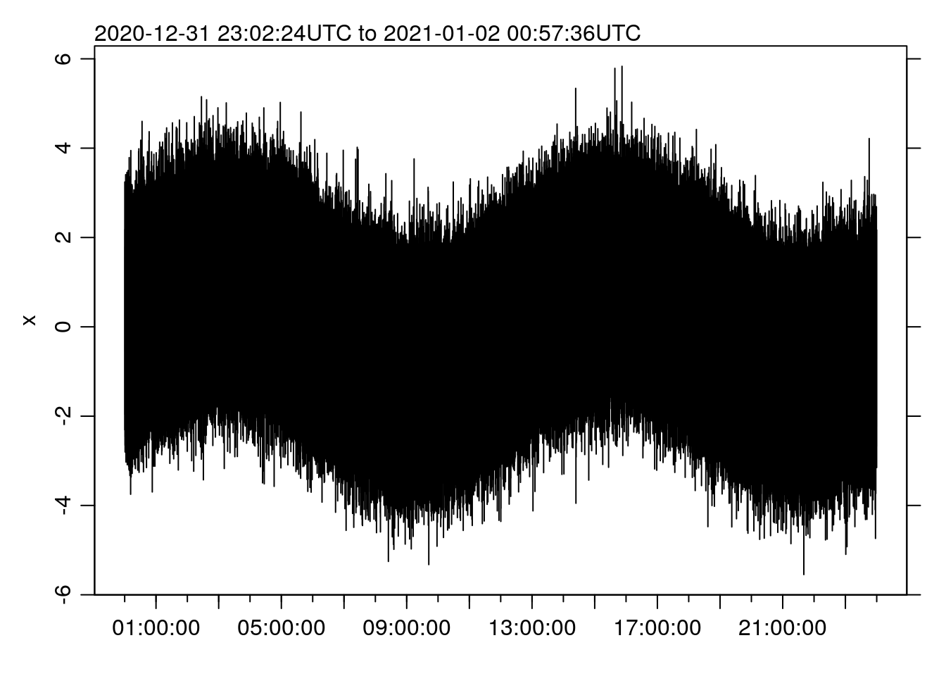
st ## user system elapsed
## 317.829 2.781 325.118(if you look at the source code for this post, you’ll see that I am taking advantage of the knitr functionality to “cache” code chunks, so that they only run a second time if they get updated). That’s 5.4 MINUTES.
To split up our input time series into chunks, from which we can extract the min/max, we can use a number of approaches. The SE post from above uses the findInterval() function and manually extracts the min/max and then combines them back together. Personally, I’ve always liked the fivenum() function, which returns the min and the max (as well as the lower/upper hinges and the median, see ?fivenum) and the R cut()/split() functions.
First, we use cut() to break the time vector up based on the maximum number of chunks that we want to plot:
Nmax <- 1e3
C <- cut(t, breaks=seq(min(t), max(t), length.out=Nmax))
Then, we assemble the original vectors into a data frame and use split() to create an object with each of the chunks split out based on the “cut”
df <- data.frame(t, x)
dfSplit <- split(df, C)
Now we create new variables by:
- averaging the
tvalues in each cut, and - applying the
fivenum()function to each cut and extracting the min/max
We then rep() the new T variable (because the new x is twice as long), and vectorize the result of the min/max variable:
T <- as.POSIXct(names(lapply(dfSplit, function(tx) mean(tx$t))), tz="UTC")
D <- sapply(dfSplit, function(tx) fivenum(tx$x)[c(1, 5)])
TT <- rep(T, each=2)
DD <- as.vector(apply(D, 2, sample))
Making a plot from the new values gives:
st <- system.time(oce.plot.ts(TT, DD))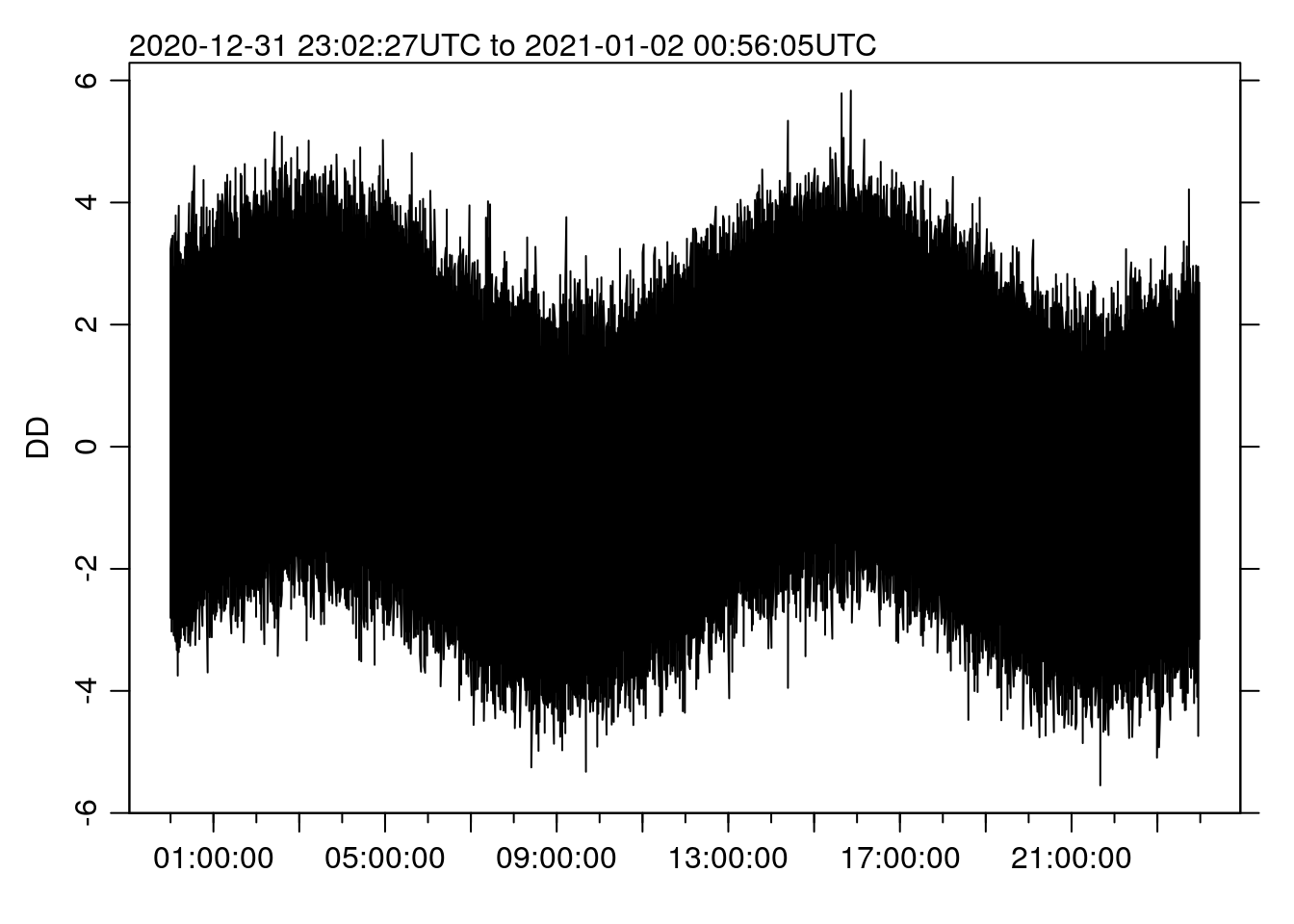
st## user system elapsed
## 0.375 0.297 0.671Making the new plot now takes more like 0.67 SECONDS, a speedup of 485 times. Can you tell the different from the “full” plot above?
Remember though – this really only works for line plots, since the missing data will be blatantly obvious if we plot as points, e.g.:
oce.plot.ts(TT, DD, type='p')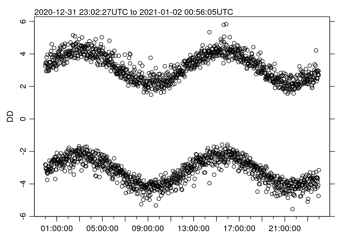
Creating the function
The example above walks through the basic steps to get a faster plot, but what we really want is a function (perhaps a replacement for oce.plot.ts()) that does it all for us.
library(oce)
## save the old oce.plot.ts
oce.plot.ts_old <- oce.plot.ts

## change the existing oce.plot.ts
oce.plot.ts <- function(x, y, Nmax=1000, ...) {
    C <- cut(x, breaks=seq(min(t), max(t), length.out=Nmax))
    df <- data.frame(x, y)
    dfSplit <- split(df, C)
    X <- as.POSIXct(names(lapply(dfSplit, function(tx) mean(tx$x))), tz="UTC")
    Y <- sapply(dfSplit, function(tx) fivenum(tx$y)[c(1, 5)])
    XX <- rep(X, each=2)
    YY <- as.vector(apply(Y, 2, sample))
    oce.plot.ts_old(XX, YY, ...)
}
There’s an issue there with the automatic naming of the y axis label (the “R way” is to use a deparse(substitute(x)) so the label matches the object name), but let’s try it out:
st <- system.time(oce.plot.ts(t, x))
st## user system elapsed
## 1.062 0.125 1.428Note that the time is a little longer than before, because now it includes the cut()/split() steps rather than just the plotting. But 1.43 seconds is still pretty reasonable.
Cue Dr. Evil laughter …↩