
Introduction
I love R (obviously). And I even love base graphics – it’s refreshingly dumb about so many things, that it means that you don’t (usually) have to fight it to get it to do what you want for a complicated plot (see e.g. legend()). The ggplot2 system is great – especially for those who find themselves adrift in the tidyverse, but in my experiments of plotting oceanographic data with ggplot I have found it to be very slow (and I’m not the only one).
However, even base R graphics can be as slow as cold molasses if you dump enough points into the plot. To my knowledge R doesn’t do anything “smart” about optimizing plots, e.g. to not render elements that are too small to be seen or will not change the color of the relevant pixel. It just tries drawing all the symbols for all the data points that were passed to it.
We can do a quick test by timing some plots with, say, a million points:
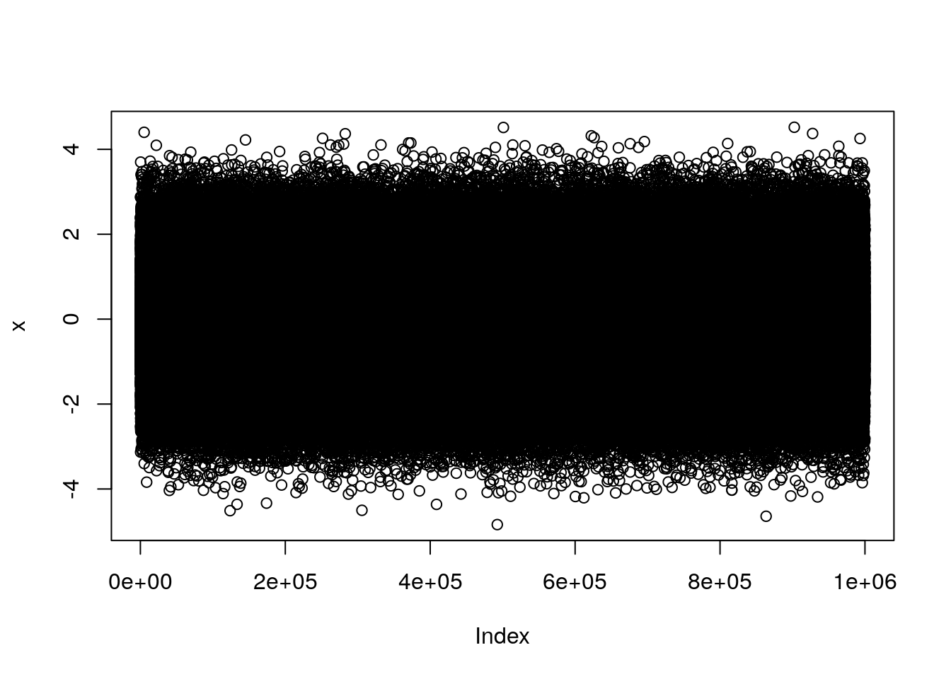
x <- rnorm(1e6)
system.time(
    plot(x)
)
##    user  system elapsed
##  49.735   0.641  54.946
system.time(
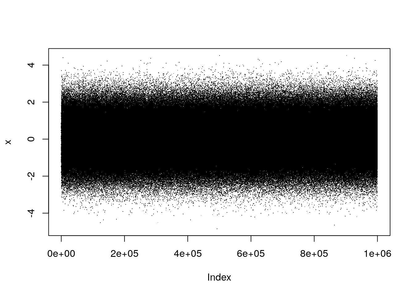
plot(x, pch='.')
)
##    user  system elapsed
##   1.094   0.078   1.243
Note that just changing the plotting symbol from the default (a circle) to a “dot/period” sped up the plotting by a factor of 20. I don’t even dare try doing that with type="l" because it takes FOREVER (approximately 5 minutes when I tried while writing this post).
Speeding up the performance of plot()
There are a few different tricks that I use to make plots work quicker. I’ll go through them here, and also a few that I’m just learning about.
1. Use a faster plot device (x11)
The default plot device on windoze (called directly with windows()) can be quite slow, as can the quartz() device on OSX. However, on both OSX and Linux, the x11() device is available, which when used with the type="Xlib" argument is able to plot much faster:
system.time(
    plot(x)
)
##   user  system elapsed
##  0.329   0.266   2.139
The downside to x11(type="Xlib") is that it doesn’t use any smoothing or antialiasing, so the plots look a little rough compared to what you’re probably used to. Using the “cairo” type can sometimes be faster (especially for image plots) and still looks pretty good.
(As far as I know there is no “fast” equivalent on windoze OS, so in order to speed things up there we’ll have to take another approach)
2. Using python?
An answer that I found while googling this suggested that one option could be to use the reticulate package to interface with the capabilities of python plotting. I haven’t tried this extensively (though as a side note I am generally interested in good ways of mixing R and python tools!), but after some installation delays I was able to get a matplotlib window to open and what took ~20s above took <1s with python.
library(reticulate)
mpl <- import("matplotlib")
plt <- import("matplotlib.pyplot")
system.time(
    plt$plot(x, '.')
)
##    user  system elapsed
##  0.281   0.188   0.493
3. Create a function to subsample before plotting
Since the problem with plotting a large data set is that it has a lot of points, one easy solution is to simply subsample the data before plotting. I’m sure that this is what software like python/matplotlib and Matlab are doing, though likely with a lot of neat tricks and efficiencies to make sure that the subsampled plot isn’t aliased in a way that changes the “look” of the data. I won’t worry about that here, but will simply create a function that trims data out of the object before plotting (note that this is how the imagep() function in oce behaves when it is given a matrix that it deems to be “large”).
sub <- function(x, sub=10) {
    ii <- seq(1, length(x), sub)
    return(x[ii])
}
system.time(
    plot(sub(x))
)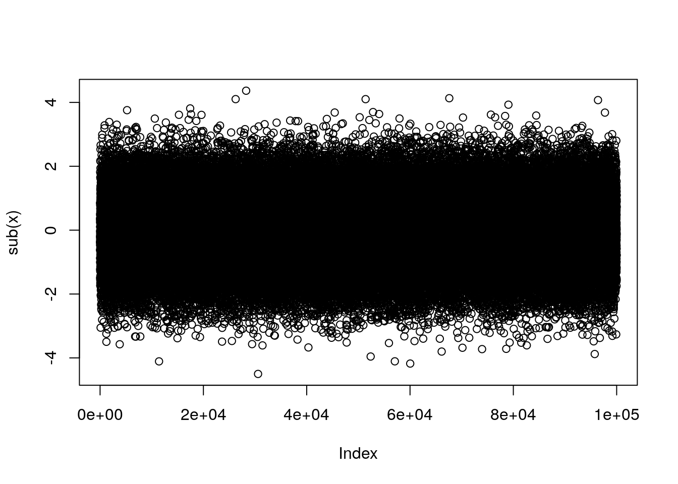
##    user  system elapsed
##   6.235   0.063   7.132